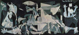
This one is Guernica by Pablo Picasso, it was painted in 1937 and it is a strong statement against war. I took the image from www.pbs.org/treasuresoftheworld/a_nav/guernica_nav/main_guerfrm.html (there you can, again find the explanation and motives behind the masterpiece). It successfully cries anti-war, there is a solemn air set by the coloring, then it comes the pain and turmoil evoked by the distorted and different placement of the elements, it is like you can hear them cry.
Posters:
I cannot show you the posters here because there is a clear statement on the page in which I found them: they are meant to be shown on that page only. But I invite you to go to www.iisg.nl/exhibitions/chairman/index.php , click on Soviet Posters and click on the poster number 32 by E. Mirzoev from 1938. I chose this poster because it is a clear example of the
so- called Personality cult propaganda, you see a big Stalin in the center of happy faces , he is the Father. It is a harmonious composition with organic forms, without rough edges, very peaceful, they are cleaverly combined to evoke reliability and gentle supremacy. In this same web page, inside the collection of Chinese posters you may find a similar design in the first poster of the list from 1949 and which designer remains unknown. In that poster the division between the people and the governmental hegemony is not marked by a difference in size but in a difference on space, that is, Mao Zedong is at the top in a invisible balcony so the people needs to turn their heads up to their protective father, crossing in their way a glorified image of the healthy power of the new government. Finally, from the same site, go to Cuban Posters and look at the third one from 1963 (designer unkwon), this poster based its message in the relationship between the three elements shown, in fact, the weapon, the chimey and the book are portrayed as being part of a three-organism symbiosis, and it really conveys the strong ideas of protecting the independence and autosufficiency of Cuba, according to President Castro.
Album covers:
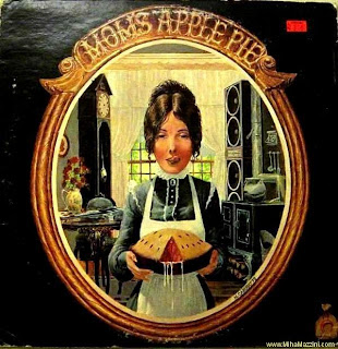
I will continue on track with two controversial albums, the first one
 is from the band Mom's apple pie that released an homonym material in 1971, I took the image from http://www.sleevage.com/ (a good collection of album covers). According to this site Apple Pies became somehow a synonym for comfort, peace, freedom across the US... so this cover challenged the concept of freedom (especially that of speech) by portraying a quite
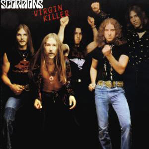
suggestive image with a "drooling/juicy" apple pie that continues to make some people cringe, amongst the perfect balanced and cozy environment of a typical housewife kitchen (with the loudspeakers??). For the second cover I am getting more controversial with a cover from 1976 by the German band Scorpions: Virgin Killers , this cover has been on the WORST, WEIRDEST (http://www.ugo.com/music/weirdest-album-covers/?cur=virgin-killer) and MOST CONTROVERSIAL album covers lists, it may be a bad taste cover but it is very strong, it was supposedly intended to depict the lyrics of the main song which

addressed the topic of children losing their innocence very rapidly in their times, and you can see actually the prepubescent girl in a "dislocated" position looking at you with deep eyes in the middle of emptyness...a life shattered by the new times. Certainly, there are other ways of presenting it, but it remains nonetheless a powerful, even more if you compare it with the alternative cover of the same album (next).

TEchnical aspects of work shown here:
Alla cuelga mi vestido, Frida Kahlo. Oil and collage on masonite. 46 x 50 cm. Hoover Gallery, San Francisco, California, USA.- Guernica, Pablo Picasso. Oil on canvas. 349 x 776 cm. Museo Reina Sofia, Madrid, Spain.
- Soviet Union (Poster 32). E. Mirzoev. Lithography, 89x60 cm
- China (Poster 1) The central people's government constitutes the only legitimate government of all the people of the People's Republic of China. Publisher: Political Department of the East China Military Region, Third Field Army(78.5x54.5 cm).
- Cuba (Poster 3) Fourth anniversary of the revolution. Publisher: Central de Trabajadores de Cuba(Offset, 79x52 cm).


